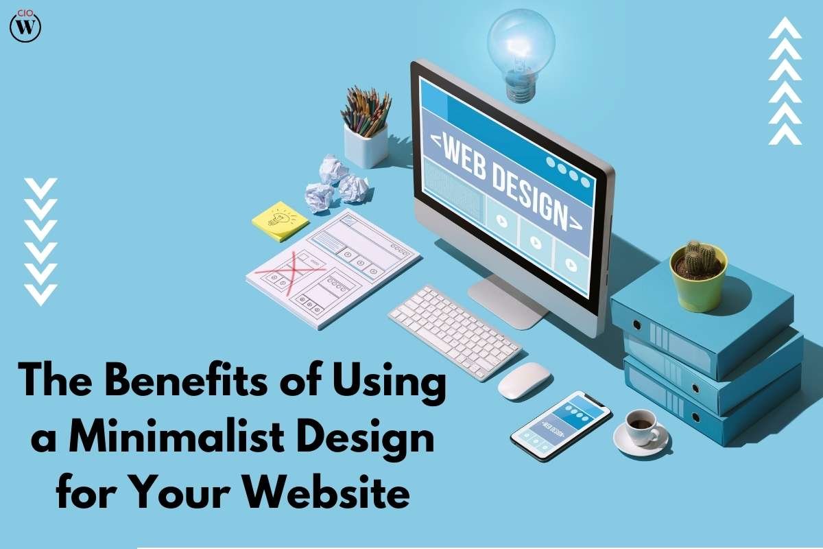
Just for you to know minimalist design is used by industries like literature, painting, music, photography, and more. As these names of industries will compel you to believe that a minimalist design is only used by artistic brands or industries, but let us tell you this isn’t the case. Using this type of design mellows down the effect and makes you stand out as you choose to be simple. As the effect is light and not too much loaded with colors and content on the website, it gives a smooth and soothing appearance to the website.
As luck may have it, a minimalist design will have an enhanced engagement rate, than a normal website. A lot of debate is going on, on choosing a minimalist design option or a normally flashy website. According to researchers, a minimalist design acts as a soother to the consumer’s mind and gives a calming effect. On the contrary, business persons believe, a bright and flashy website will help to attract more audience. The debate will go on and on.
Meanwhile, we have some benefits of a minimalist design website. Here they are:
1. Website is way lighter
The page loading time is perfect. As soon as the website is clicked on, it will not take more than 3 seconds to load the page. That is the exact time that users wait for a page to open. In a minimalist design, the agenda is to achieve more in less time. For eg, if you run a product design company and your pages aren’t opening faster then it’s literally of no use. The patience of users has become less than usual. So, it is necessary for the page to open in less than 3 seconds, and it is possible via such type of a design.

2. Enhances content focus
As they say content is king, we are either consuming content or creating it most of the time. Entertainment has taken a major turn and users are obsessed over everything and anything that is new. So in the case of a minimalist design, users are not distracted by the images and elements overly used on the website as they do not exist. They get a chance to purely focus on the content of the website. A visual hierarchy while posting content via this method works wonders. Try it, it may turn out good for you.
3. Makes website breathable
As there are white spaces in between, users while navigating get a chance to breathe. It is a term used in the sense that as users navigate through the website, they’re continuously absorbing in what’s in the website, so a filled website will make them take in too much information to process, not giving their brains the time to breathe. But in the case of a minimalist design, the white patches give a soothing effect and make the users calm while navigating through the website.
4. Usability

As mentioned above, the minimalist design gives a calming effect that increases the user experience of the website. As a higher UX persists, people engage with it more and more, finding the content interesting too. Be mindful of engaging content on such type of website design. It should really be catchy and engaging, while you are strategizing the same. As the website navigation is enriched, and the posted content is good too, the engagement rate increases substantially. Not to forget the design and navigation is easy for the audience to absorb.
5. Brings more conversions
As the website content, page loading speed, lightness of the website, and user experience all are in place there is a high engagement rate. Via Google Analytics when you observe a good engagement rate, gradually you will start having conversions. Sometimes people like soothing and light websites that don’t cause much buzz inside the website. When you know when the time to use a minimalist design for a website is, you know your business and your target audience perfectly.
6. Pop-ups are cut down
In this type of website design, pop-ups are a no-no. As the notion of pop-ups isn’t there website visitors are not annoyed by the constant appearance of the same. It lets the users be with the website and check it out through and through. Small obstacles like the “REGISTER NOW” buttons i.e. Call-To-Actions (CTA) are trouble for the users as they have to divert their attention to close the appeared pop-up on the screen. This may increase the bounce rate, hence, not putting pop-ups in this website design is the best thing to do.

Who should use it?
As mentioned above, it is a misconception that artistic firms like music companies or those in photography use minimalist design. This is an open-ended question actually. If you know your business and target audience pretty well, then you can think of using this design if it suits your thinking. But firms like e-commerce apps, and IT firms are ones who cannot use these designs for their websites. As their scope of work is so big, they need to post a huge amount of content and images on their website to attract users.
Business persons can decide on the same and choose whether to implement this website design or not. It totally depends on the nature of the business, the types of customers, their social media presence, and the dedication with which they want to nurture their website. Keeping the website on a good ranking needs tremendous digital marketing efforts, so if they’re ready to do with managing their business then they can surely opt to use a minimalist design if they like it that way.
Conclusion
If you decide to go for a minimalist design, also remember to not overdo it. Meaning, do not use too less of content to post on the website. Excessive breathing space will make the website look not filled enough and makes the impression that the website owner isn’t that interested in the brand.
It creates a negative impression and makes it look unpleasant. So, remember not to overdo minimalism and be accurate and reasonable while implementing the same. In the field of product designing, you will be well-recognized as they are on a constant lookout for a minimalist type of website design.


