
Google Maps, a longstanding navigation favorite for Android users, has undergone recent enhancements to improve its functionality and visual appeal. Despite its historical prominence, the app has faced criticism for its mapping accuracy. However, Google has consistently updated Maps with visual improvements to maintain compatibility with the latest Android versions. Notable recent updates include the integration of location-specific weather information and revamped colors for water bodies and green zones, aligning with the aesthetics of iOS. The tech giant now appears ready to introduce a redesigned layout for navigation options, aiming to enhance user understanding and interaction.
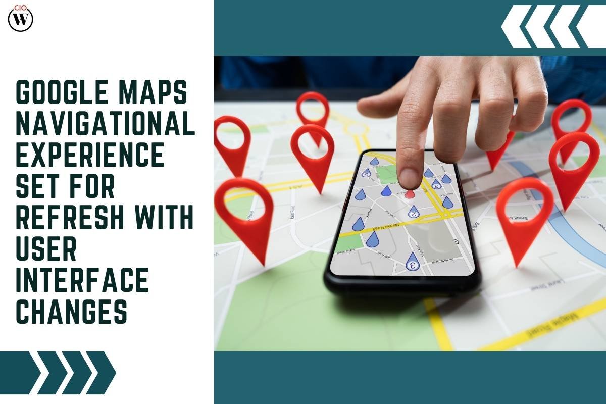
Changes in Navigation User Interface
The Navigation User Interface (UI) in Google Maps becomes visible upon selecting a destination. In the latest reported changes, users with version 11.113 of Maps have experienced alterations in the UI design. While not yet widely available on Android, these changes bring subtle yet noticeable modifications.
The bottom card, which emerges when a pin is dropped, now features rounded corners. This card includes options to start navigation, view photos, ratings, and accessibility information, with additional buttons for sharing the location or closing the card without the need to swipe down. Furthermore, cards for cities and landmarks also adopt rounded corners and the same buttons, providing a cohesive visual experience. When expanding the card, it no longer occupies the entire screen, maintaining a small portion of the map at the top to differentiate it from a full-screen UI.
Modernizing the Navigation Experience
Another noteworthy alteration lies in the navigation UI that appears when a destination is selected and the Directions button is pressed. In the redesigned interface, the origin and destination are presented in a floating box with rounded corners, a departure from the previous forehead-like banner design. The option to switch modes of transportation has also been relocated to the bottom card, making the process more intuitive.
This allows users to view their estimated time of arrival directly under the chosen mode of transport in the bottom card. While the bottom card can be expanded, it no longer transforms into a full-screen UI. Instead, it retains its original layout, displaying turn-by-turn directions and essential information like estimated traffic congestion.
In conclusion, these UI changes are currently being tested by a limited group of users and are not yet widely available. It remains to be seen if Google Maps will introduce further modernizations before the design is rolled out on Android or reaches the iOS client. Users eager to explore these changes can attempt to update the app or consider force-restarting it, anticipating a potential shift in the navigation experience.